There are a total of 22 nominations in the Visual Appeal category. I'm posting them in digestible chunks.
With that out of the way, let's continue.
11. COLOR THE GRAYSCALE - ANIMATION DOMINATION

EPISODE WATCHED:
Asterix and the Vikings
Cars
BIAS ACKNOWLEDGEMENT:
I was aware of this show and follow it. Karen and myself have been in contact and have collaborated previously. That and she wrote the first guest article for this blog.
MY THOUGHTS:
Nearly everything is done from a single angle. Strong lighting with a backlight. There's attention to color scheme that really makes the frame pop. Great intro. Shots other than the main camera angle often aren't as visually strong.
12. PAN-PIZZA - REBEL TAXI

EPISODES WATCHED:
My Little Pony Friendship Is Magic
Top 10 Disappointing Games [Part 1]
Top 10 Disappointing Games [Part 2]
Ned's Declassified Review [Reviews]
I'd never heard of this show before the judging process. As with Jaimetud, I had some difficulty with this entry but for entirely different reasons.
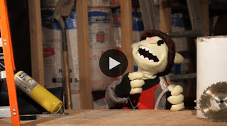
There absolutely is skill present in the illustrations. Pan-Pizza himself has a great deal of character, and the main image is strong. Unfortunately, it doesn't leave much of an impression in the episode because it goes by so quickly and the videos so rarely cuts back to the character.
It actually took me a couple episodes to make the connection that tank Pan-Pizza's sitting in is actually the Rebel Taxi of the show's name.

Frankly surprised there's not more done with that concept. A taxi driver talking about the shows he's seen to his eccentric passengers would make an interesting framing device for a review show of this vein.
As with many DIY review series like this, there are several cut-away gags. Unlike those other series, I had difficulty identifying which were created for the show and which were taken from other sources. This isn't necessarily a bad thing from a viewing experience, but it does pose a problem in trying to evaluate the visual appeal of the show itself.

What is undeniably created for the show is undeniably high quality and visually compelling. Color schemes have strong cohesion and there is attention to composition.
13. MOVIE FEUDS

EPISODE WATCHED:
Rudolph the Red-Nosed Reindeer
BIAS ACKNOWLEDGEMENT:
I'd not heard of this series before this series.
MY THOUGHTS:
The background and title sequence are polished, and there's attention paid to the lighting (yay backlight!). The green screen effect is solid, but there's a green tinge to the characters. There is very little variety to the shots, sticking largely to the single frame. It's effective for the show's purpose, but the frame's composition doesn't really pop.
14. NOSTALGIA CHICK

EPISODE WATCHED:
The Christmas Shoes
BIAS ACKNOWLEDGEMENT:
I've followed this show for some time.
There's variety in the shots, and occasionally there will be a visually interesting image, but the strength of this show is not in its visuals.
15. PHIL BUNI - THE BUNNY PERSPECTIVE
EPISODE WATCHED:
The End of Evangeleon
Predator 2
BIAS ACKNOWLEDGEMENT:
I've followed this show for some time. I also have been in contact with the show's creator.
There's attention paid to the color scheme and the set design. The puppet was custom-designed and built. Twice. Lighting doesn't jump out, but is intentional. Same with the framing. That's really what everything about this show feels like: intentional, approachable, with nothing so polished that it distracts.
16. THE SHADES - ANIME TAKEOVER

EPISODE WATCHED:
Top Ten Anime Theme Songs
BIAS ACKNOWLEDGEMENT:
I was aware of this show previously and have watched several episodes. We've been in contact in the past.
This show has heavy technical limitations. John does a lot with what he has, but doesn't overcome those limitations.
Hey everyone! This entry is dedicated to Stephen from Animated Analysis for commenting on an earlier post (Because I do that. Comment, people!).
Something I feel I should mention in light of his comment; when I'm judging at a show I'm unfamiliar with, I will always watch part of a second episode to compare visual styles. If both have comparable visual styles, I'll only watch the one episode (generally the more recent of the two). If the style is substantially different, I will watch both.
For someone like Linkara, who I'm familiar with, I'll look for a more visually ambitious episode rather than his regular episodes.
How did I forget Pan Pizza?! I love that guy!
ReplyDelete