A bit of an update about the finalist choosing process before I go on with today's post.
FOR EACH CATEGORY
PRIMARY JUDGE is responsible for choosing the first 2 FINALISTS.
After this, the SECONDARY JUDGE chooses the 3rd FINALIST.
And finally ROBERT MILLION chooses the 4th FINALIST.
It is done in this order.
Okay, moving on to more of the nominees for Best Visual Appeal.
6.
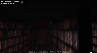
PHELOUS
EPISODE WATCHED:
The Human Centipede 2
BIAS ACKNOWLEDGEMENT:
I was aware of this show and have followed it in the past.
MY THOUGHTS:
The color pallet here really pops and the backgrounds are visually interesting. There is attention paid to lighting, though shadows are cast on the back wall. The camera work is solid, though occasionally there are some focus issues. It is important to note this episode used a non-standard location.
7.
JAIMETUDEPISODES WATCHED:
ZOMBIE LAKE
PLANET OF THE APES
FROM PAGES TO PICTURES - STAND BY ME
MY PROCESS FOR THIS NOMINATION:
I actually had a bit of difficulty with this entry. I'd never heard of him and I couldn't see anything that would really warrant attention in visual appeal in the episode I'd chosen to watch... yet he'd been nominated by three separate people. I ultimately ended up watching several of the episodes.
And finally I found this sequence.

I can't tell if this was green screen or if it's filmed on a set. That's a good thing, either way. The composition in this sequence is competent, and I've seen material like this in decent short films.
It contrasts heavily with the episode's opening scene.

Or in a more recent Halloween episode, which has fairly bland framing in front of a decent green screen effect.

Compare the above two shots with the shot below.

The above was filmed for the 'Planet of the Apes' review. It's appropriate to the material being reviewed and appears right out of a low-budget 1970s science fiction film. The lighting is a bit flat, but is bright enough not to be distracting. The composition and editing are competently handled.
For the final episode I watched, from his 'Pages To Pictures' series, I have to admit there was a quiet, competent style to it. The colors were warm and the shots felt appropriate.
8.
SOUTH JERSEY SAM EPISODE WATCHED:
TOP 13 BEST FOXES
BIAS ACKNOWLEDGEMENT:
I've never heard of this show previously.
A bit of an aside, but there really is no reason the average length of his episodes should be approaching an hour in length. The information is decent for each entry, but a 13-part list like this would probably have been better served being 13 separate videos.
MY THOUGHTS:
There is a charm to the Machinima style of presentation. The slide-show approach helps to minimize animation limitations of earlier episodes (well, at least of the first episode). There's a rough classically animated segment which seems to have been done specifically for the episode which is very well handled.
9.
SOME JERK WITH A CAMERAEPISODES WATCHED:
CAPTAIN EO PART ONE
CAPTAIN EO PART TWO
BIAS ACKNOWLEDGEMENT:
I'd heard of the show before but hadn't really given it a chance.
MY THOUGHTS:
This is a series about the attractions of Disneyland and it's filmed entirely at Disneyland. Every shot is a different location. The hand-held camerawork doesn't distract and there's strong editing. There's a documentary charm to it, but this show's strength is not in it's visuals.
10.
COUNT JACKULAEPISODES WATCHED:
HALLOWEEN SPECIAL #4: GARFIELD
UNREST
BIAS ACKNOWLEDGEMENT:
People had mentioned him to me previously.
MY THOUGHTS:
The costume and set design create an interesting horror esthetic. There is attention paid to lighting is some episodes. There's little variety in the shots, but the framing does what it's supposed to.
 A while ago I started a little side project called 'Lens Cracker'. I always liked the idea, but I never really did much with it save for a rough cut of the pilot. Consider this the magnum opus.


 The Game Show Reviewer

