I do try to take into account the series as a whole, but I use individual episodes to stand in. This is easier with series that I'm already familiar with, where I will look at the series at its most visually ambitious, but for those that I'm not I will look at the visual style from at least two episodes released at different times (i.e. a more recent episode and an older one). Essentially I watch enough to get a sense of why the show was nominated for its visuals.
I will admit this isn't always perfect, but I'm fairly confident in it over-all. An example of this I will absolutely admit to this limitation is Animated Analysis. I'd watched the most recent episode The Brave Little Toaster, and as a control group I looked at the framing and visuals in The Brony Phenomenon and Sonic Underground (not the full episodes, but I scanned through them). A later look at Top 8 Insane Animated Villains shows that the show does on occasion have strong cinematography.
But enough stalling. Ladies and gentlemen, the final nominations from the Visual Appeal category.
17. SPOONY - THE SPOONY EXPERIMENT

EPISODES WATCHED:
Final Fantasy X-2 - Part 2
Final Fantasy X Finale
BIAS ACKNOWLEDGEMENT:
I have followed this series for some time.
The visual effects, when the show has them, are handled well more often than not. As with the green screen effect. The editing is solid. There are some moments of decent shot composition through the series, but it's not consistently strong visually.
18. SINDRA - KEEP PLAYING

EPISODES WATCHED:
Rewind - Sonic 20th Part 1
Rewind - Sonic 20th Part 2
Rewind - Diablo (PS1)
BIAS ACKNOWLEDGEMENT:
I had not heard of this series previously.
Low production values with no distinctive visual style to speak of. Some interesting costumes.
19. ANGRY VIDEO GAME NERD

EPISODE WATCHED:
Dark Castle
BIAS ACKNOWLEDGEMENT:
I had not heard of this series previously.
Kidding.
Set design is paid attention to. In the past lighting has tended to be a bit over-exposed, but has improved in more recent episodes (still no backlight, though). The show is frequently ambitious in its shots and action sequences. Very few shots pop.
20. DAVID A. ROSE - DVD SHELF MOVIE REVIEWS

EPISODES WATCHED:
Mask of the Phantasm
An American Werewolf in London
MY PROCESS:
I hadn't heard of this series in the slightest when I started this out. To be honest, I wasn't expecting much out of it going in with the fairly bland title.
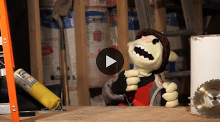
Popping it on, after a short but promising title sequence I was greeted with this image.

Here the character feels drained of color, and the sharpied-on 'MOVIES!' didn't help the first impression. On the background, the note I took reads: Background, though appropriate, feels artificial. Not especially compelling.
I say that because I want to give a sense of where my mindset is at this point. I found the material surrounding the show, such as the screens for the show-trivia and the title graphic design were visually strong. The all-too short moments of animation were like-wise top notch.
And then, as the episode drew to a close, the background I'd taken as a bland Photoshop design suddenly became dynamic as the camera craned up and out into the credits. Seamlessly.
My jaw kind of hung open for a second. Further accentuating this were credits that actually imitating the credits of the Batman animated series, the subject of the review.
After it ended, I popped on another episode. The Halloween-themed American Werewolf review had its main frame looking like this.

 This sequence is fully, skillfully animated. It's also funny, and is motivated by the material (the skit is an outlet for a commentary on the heavy number of horror reboots/remakes of late).
Everything he's doing visually is motivated by the material being reviewed.
Okay, this is the kind of thing that gets me excited about the DIY review scene; there are flaws, sure. There are limitations in the production, and the knowledge of composition. The pacing is a bit slower than perhaps it could be. But my god... This is a guy who's bringing something new to the table and pushing the boundaries of this style of videomaking and reviewing.
So, the assessment.
There is attention paid to the lighting, though some episodes are better lit than others. The green screen effect is pulled off decently. Composition isn't especially impressive. The backgrounds are appropriate, and frequently help to build a visual style distinct and appropriate to the material being reviewed. The title graphics, informational cards, and credits are all strong. The animation, when used, is strong.
21. TJ OMEGA - TJ TV

EPISODE WATCHED:
Heathcliff vs. Garfield
BIAS ACKNOWLEDGEMENT:
I have followed this series for some time. I have also been in contact with TJ.
Very strong title sequence. The strength of this show is not really in its visuals, though.
22. THE BLOCKBUSTER BUSTER

EPISODE WATCHED:
Red Riding Hood
I'll be shorter here, I promise.
I'd heard of this guy a year ago, and I'd written him off after watching an older episode. There was more ambition in the shots than most, but those shots didn't feel especially skilled in their execution. On more judging-a-book-by-its-cover notes, his title cards weren't especially skilled and his website... well, it's an Angelfire website with all the trappings that go with it.
In private, I've been outspoken against this show.
Today I'm eating my words with a side of humble pie.
 The composition is overall solid, and the editing is tight. Lighting is well-exposed. I applaud the success he's had.